In this week's tutorial, we learnt more about the creative strategy and applying them into our creative brief. Creative brief is part of the creative process before an advertisement or campaign is created. This is to make sure we are clear on which path we are heading and thus, we will not get lost while creating the advertising or campaign.
The first point to ponder is the prospects. For example, their demographics and psychographics. This is to have a clear mind on who our readers or viewers are. The second point is the objective of the advertisement. This is to know the purpose of the advertisement, whether it is to introduce a certain product, to create awareness or to convince. The third point to ponder is the benefits for the customers. This is to know what will the customers gain from this product and the point that we want to highlight in the advertisement as the unique selling point.Also, the fourth point to ponder is the tone of the advertisement (friendly, fun, etc.) or the brand character (reliable, trustworthy,etc).
From the exercises given to us, I find the second one more interesting as we get to let our imagination run free and have a test on how is it like to be in the advertising company while coming out ideas for an advertisement. Also, we get to implement the things we have learnt earlier from observing an advertisement on a creative brief to this creative brief while observing a product we've never seen before.
Overall, the tutorial was a great experience hearing different ideas from different group and it was also a chance for us to learn from our mistakes as it will help us further in our assignment and future encounters.
By: Renvin Kaur Sidhu
Sunday, September 29, 2013
"Caffeine For Your Feet" by Fit Flop

(Source: http://www.shoebuy.com/caffeine-for-your-feet/cp331279)
Media: Print ad
Title: Caffeine For Your Feet
Sponsor: FitFlop Ltd., London, United Kingdom
Prospects: The target audience for this ad are generation Y, to be specific its the working adults aged between 22 to 35 years old. Besides that, target customers are living in a middle class with fresh and active lifestyle.
Product: Fit Flop Footwear Problem: There stores high quality and exclusively designer Fit Flop footwear for their prospects. Don't only go for the styles, but also get the appropriate size footwear.
Objective: To Convince the audiences that once they slip on their footwear, they will never want to purchase any other brand anymore. The reason for this objective is that Fit Flop still focuses on delivering the best in biomechanics with wider variety of styles.
Strategy: The ad uses visuals and headline to portray the benefits which is showing the feet of a woman jump high happily wearing Fit Flop, it matches the theme very well. The headline "Caffeine For Your Feet" is also shown clearly in the ad, same goes to the logo. In addition, the benefits customer will get by purchasing Fit Flop are to see footwear with fresh eyes, and get the equal parts fun, fearless and functionality footwear. Besides that, Fit Flop are ergonomically optimised and biomechanically engineered to make the wearer feel fantastic.
Tone: The tone for this ad matches the theme very well and the setting of this ad makes us think that the footwear are nature friendly. In addition, this print ad as the headline "Caffeine For Your Feet" is very attractive, it catches the readers' attention and leads them to the product. The ad itself is very simple yet catchy.
Brand character: The brand reflects a reliable, fun and friendly character. Reliable because Fit Flop created a multi density Microwobbleboard™ midsole, and with expert biomechanists it delivers the best in biomechanics. Both the theme and setting of this ad makes customer thinks that products are nature friendly.
By: Michelle Liew
Saturday, September 28, 2013
Basic Instinct by OREO

(Source: http://www.advertolog.com/oreo/print-outdoor/basic-instinct-15070205/)
Media: Print ad
Title: Basic Instinct
Sponsor: Cheil Worldwide, Seoul, South Korea
Prospects: The target audience for this ad is generation Y
as this generation would be at the age range where they can understand the
message in the ad clearly. They would also be educated and fall under middle
class and above. Besides that, the
target audience for this ad would be more open minded and fun.
Product: Oreo cookie
Problem: There needs to be Oreo cookie when there is milk,
and vice versa.
Objective: To convince audience that Oreo is the best cookie
and most compatible with milk. The reason for this objective is to increase the
number of potential customers.
Strategy: The ad uses visuals to portray the benefit of the
product which is showing the baby holding an Oreo cookie while feeding on the
mother's breast milk, emphasizing the fact that the product is milk's favorite
cookie. The benefit customer will get is being able to choose whether to eat
the cookie alone or side it with milk for maximum satisfaction. Besides that,
customer will also benefit from being able to consume two different items that
match well together.
Tone: As the ad does not contain much words, the tagline
which appears at the corner of the ad shows a confident and convincing tone. It
is also very direct and suggestive. It tells audience straight to the point
where the product is milk's favorite cookie and also indirectly suggests
customer to match it with milk while snacking on the product.
Brand character: The brand reflects a fun and interesting
character. It also shows a daring and adventurous side of the brand as the ad
uses sensitive visuals that might not be accepted by audience.
By: Ng Yee Peng
Sunday, September 22, 2013
Reflection Post 2
During the 18/9 tutorial class, we have learned that appeals is necessary for an advertisements because having appeals can influence the consumer feelings towards the product and educate the way of audience view themselves on buying which products that can benefits them. The message that advertising appeals conveyed as the way of persuading and influencing the buying decisions of a consumer on a certain products.
There are two major types of appeals, they are Emotional versus Rational appeals. First, an emotional appeals is relate to one's social and psychological needs for buying a product, there are two subsets which includes social and personal aspects. Emotional appeals is so effective and works emotionally on many consumers, it motivated and persuaded them to make buying decisions on the products. Therefore, most of the advertisers believes that an emotional appeals work well at selling products differently from the competing product brands and its offerings.
Whereby, the rational appeals are totally different compare to the emotional appeals. Rational appeals focused on the consumer's practical and functional needs for the products and it concerned on the price with the reasons or benefits of owning the products. Print media is particularly used for rational appeals with good successful and it usually used by small businesses to ward off the competitors.
Reference list:
http://www.infojug.com/advertising-articles/types-of-advertising-appeals.html
By: Michelle Liew
"Try Telling Him It's Just A Little Fur Trim" by PETA Asia Pacific

Media: Internet
Ad Title: Try Telling Him It's Just A Little Fur Trim
The ad features elements that grabs the audience's attention
easily. The close up of the main character makes the ad more emotional and
brings a stronger impression of the message towards the audience.
Headline: Try Telling Him It's Just A Little Fur Trim
Visuals: The ad shows Natalie Imbruglia in bare skin
holding a rabbit in her arms, showing that she would rather go naked than wear
fur.
Prospects: To let
audience realize the cruelty of removing animal's fur and reject wearing fur.
Problem:
Consumers favouring and buying fur clothes and products.
Objective: To
encourage audience to stand up against fur clothes and products, fight the
cruel fur trade and help millions of animals worldwide.
Strategy: Using an
emotional approach by featuring the rabbit in the advertisement. This would
make audience feel sympathetic towards the animals.
The appeal of
this advertisement is the cruelty of removing fur from these animals. The headline
of the ad suggests audience to tell a small animal that removing fur off its
back is just a little trim. It uses the audience's love towards animals and directing
the problem back to the audience, making them realize that removing an animal's
fur is not just a little trim and it is an extremely cruel action instead. Therefore,
with Natalie Imbruglia holding a rabbit to her bare chest, it shows the
solution of the problem which is to stand up against the usage of fur in
apparels and products.
By: Ng Yee Peng
Saturday, September 21, 2013
"Don't buy exotic animal souvenirs" by WWF

(Source: http://www.techinasia.com/createive-fear-appeal-ads-from-wwf)
Media: The Internet
Ad Title: Don't buy exotic animal souvenirs
Headline: "Don't buy exotic animal souvenirs"
Visuals: The advertisement features the inside of the airport and a tourist or a traveller who is rolling her suitcase outside which is leaving a trail of blood that symbolizes the exotic animal that has been killed and been made into a souvenir which has been bought by the tourist.
Prospects: To get readers to take action, help stand up and support the cause.
Problem: Consumers buying exotic animal souvenirs from overseas.
Objective: Having the readers to stand up for this cause so that the extinction of exotic animals will decrease slowly in future with the being taken.
Strategy: It is to appeal fear in the readers eyes to grab their attention on how they convey the message from the advertisement and to take action from it.
This advertisement appeals fear from the readers, the headline from the advertisements makes the readers think twice from the message that is being decoded from the advertisement. Furthermore,the advertisement from WWF determines an act that if it shall continues it will cause harm to exotic animals in future. The advertisement extracts the negative effect from the readers and pin points the solution from the problem.Thus,the solution of the problem to the readers would be to take action, increase the awareness and also for readers to stand up for their cause.
By Wong Mei Yee
Monday, September 16, 2013
Reflection 1
During this tutorial, we have learned about the 12 master formats of advertising, also known as Gunn's 12 Master Ad Formats. After learning these master formats, we looked at various commercials and tried to identify which formats are being used. Our group members have chosen a total of 4 advertisements from print media, such as magazines and newspaper. We identified the format that each advertisement has applied, which includes "Associated User Imagery", "Symbolize the Benefit", "Ongoing Character or Celebrity", and "Unique Personality Property". The one we chose as the best print ad among these four was the newspaper print ad by CIMB Bank that used "Associated User Imagery" format. The ad promotes CIMB's online banking service and associates it with audiences that have busy lifestyles and seek for convenience. Hence, we presented an alternative approach for the ad, which is to use "Symbolize the Benefit" format instead of stressing on the problems target audience are facing. We decided to show the users telling how convenient and efficient the service is in simple sentences such as "Wow. Online banking is so easy!", using chat boxes and simple font and graphics.
After
listening to other groups' presentation on their different approaches for the
print ad they have chosen, I have learned that different formats can be used on
the same ad to target different audiences. Besides that, a commercial can sometimes
incorporate only one format, and can also incorporate a few formats at once. By
using learning master formats, I have also learned how to identify advertisements
and how advertisers make their ad memorable towards their target audience.
Reference
list:
The Star 2013, CIMB
Bank print ad
By: Ng Yee Peng
Target Hit for Tender and Fairer Skin - Bio Essence
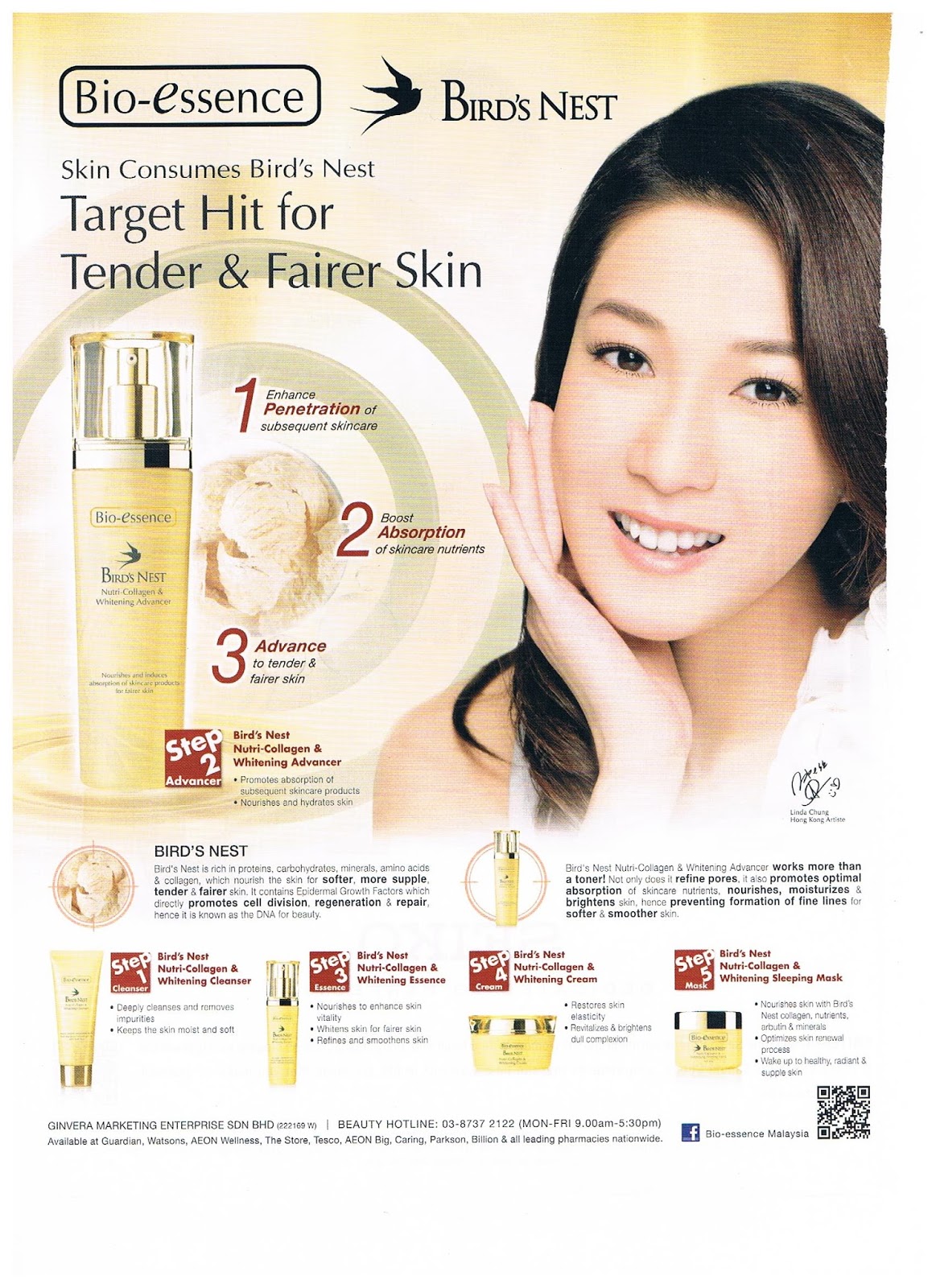
(Source: CLEO Magazine September 2013)
Media: Magazine Advertisement
Ad title: Target hit for Tender & Fairer skin by Bio Essence
The celebrity face catches the eye of the readers at once when the page is turn. "Target hit for Tender & Fairer skin" is the headline that grabs the attention of readers as it is related to readers whom wants to have tender and fairer skin like a celebrity.
Headline: Target hit for Tender & Fairer skin
Sub Headline: Skin Consumes Bird's Nest
Body Copy: 1 Enhance Penetration of subsequent skincare. 2 Boost Absorption of skincare nutrients. 3 Advance to tender & fairer skin.
Step 2 Advancer: Bird's nest nutri-collagen & whitening advancer (promotes absorption of subsequent skincare products) (nourishes and hydrates skin)
Bird's Nest - Bird's nest is rich in proteins, carbohydrates, minerals, amino acids & collagen, which nourish the skin for softer, more supple tender & fairer skin. It contains Epidermal Growth factors which directly promotes cell division, regeneration & repair, hence it is known as the DNA for beauty.
Bird's nest nutri-collagen & whitening advancer works more than a toner! Not only does it refine pores, it also promotes optimal absorption of skincare nutrients, moisturizes & brightens skin, hence preventing formation of fine lines for softer & smoother skin.
STEP 1 Cleanser Bird's Nest Nutri-Collagen & Whitening Cleanser(deeply cleans and remove impurities) (keep the skin moist and soft) STEP 3 Essence Bird's Nest Nutri-Collagen & Whitening Essence(nourishes to enhance skin vitality) (whitens skin for fairer skin) (refines and smoothens skin) STEP 4 Cream Bird's Nest Nutri-Collagen & Whitening Cream (restores skin elasticity) (revitalizes & brightens dull complexion) STEP 5 Mask Bird's Nest Nutri-Collagen & Whitening Sleeping Mask (nourishes skin with bird's nest collagen,nutrients,arbutin & minerals) (optimizes skin renewal process) (wake up to healthy, radiant & supple skin)
The Ad Strategy: This advertisement uses one of Gunn's 12 Master Formats of Advertising which is Ongoing of character or celebrity as Bio Essence wants to be associated with a celebrity ambassador so that readers can be reminded that the celebrity, Linda Chung is a representative of the brand Bio Essence.
Slogan: Bio Essence Bird's Nest
Visuals: This ad features the gold colour background to enhance the beneficial factor that the product will give the skin a glow like the colour which attracts the reader. It also has the visuals of the product place in the advertisement like the cleanser, advancer,essence,cream and the mask to show how the actual product will look like to the readers.
By: Wong Mei Yee
"Who goes to a bank branch these days?" by CIMB Bank

Media: Newspaper
Ad Title: " Who goes to a bank branch these days?"
The big headline being at the center of the page catches the eye immediately when a reader looks at the page. With the headline "Who goes to bank branch these days?" also catches the readers' attention as it is related to the lifestyle almost every reader are having nowadays where everything can be done digitally through the internet anytime and anywhere instantly.
Headline: " Who goes to a bank branch these days?"
Sub Headline: Kwik Account. The First account that can be opened anytime, anywhere.
Body copy: Account activation is instant and no deposit is required. That's how the Kwik Account has been designed o suit your busy lifestyle, to offer more convenience. Open your Kwik account at www.cimbclicks.com.my now.
CIMB Bank. Leading in online banking services.
Open a Kwik Account now, transact and stand to win exciting gadgets.
To find out more, visit www.cimbclicks.com.my
Ad Strategy: This advertisement uses one of Gunn's 12 Master Formats of Advertising which is Associated User Imagery as CIMB bank wants to be associated as the bank of leading online banking.
Slogan: Asean for you
Visuals: This ad features the use of negative space by using a black background with white wordings to enhance the reader's focus on the headline. This advertisement also uses a few visuals featuring gadgets such as smartphones and cameras with young adults in it which shows that they are the target audience of this ad.
By: Renvin Kaur Sidhu
About Us (The G6 Advertising Agency)
The G6 Agency- By using the force of the G (group) Power, 6 close friends (Renvin Kaur, Ng Yee Peng, Michelle Liew, Wong Mei Yee, Blake Chen and Mikha Chan) started this Agency in the year of 2013 and is now recognised as one of the fastest growing and most experienced advertising agency. Each and everyone of us have this special routine in our agency where we don't just remain in the same position but by switching our roles every week to give us an equal opportunity to learn more knowledge based on the continuous leaning in every tutorial. Our mission of this blog is to do a collection of tested, proven advertising and sales letters which is the "Swipe File" every week. It's a file that consists of templates to letters, images and documents that worked. The information will be adapted and used for our own writing purpose and needs in the future. Through this blog, we will also summarize the tutorial every week to keep track on what we have learnt during the lessons.
In conclusion, we wish to serve our clients better through this blog by getting them to know more about the ads appearing on the magazines, newspaper, or even social networking sites and also by learning new information through tutorial lessons every week.
In conclusion, we wish to serve our clients better through this blog by getting them to know more about the ads appearing on the magazines, newspaper, or even social networking sites and also by learning new information through tutorial lessons every week.
Subscribe to:
Posts (Atom)